Original Photo
Edited
To change this photo, i first decided that i wanted to crop it out. So i made it smaller and then used the eraser tool to help delete what i didn't want in the image. To change it into black and white i used a tool to help me do so. I found it hard to find and work out first, but found it useful to try out all different kinds of themes to go on top. One which made this photo look a bit comicy however, after trying out a few i felt that it looked best in it's original state. This photo is very simple and only really meant me getting rid of the rest of the photo and changing it into black and white. It didn't need much more to it as it is serving the purpose of showing unity.
Original
Edited
This photo i liked because of what the band is called 'Out of the Closet'. As it is showing them coming out of a wardrobe it is doing the job well. The focus is not being taken off of them by using an outrageous colour or layer on top which might make it look like it's behind glass. The only adjustments that i made was changing the levels of the photos brightness and then like above making it into black and white. I made it into black and white because it is not a main feature on double page spread and so i didn't want it to take the focus of the other photo.
Original
Edited
This photo was taken outside and gave a different location for them to be in. As it was outside I wanted to make it feel dark. So i changed the levels of brightness to make it darker than it was. By doing so it made their accessories look really colourful and gave them that shimmer which an artist needs. They are also being shown as togetherness which shows they really do like eachother and that it's not fake. The only things that i changed was the levels, so not much had to be done by this.
Original
Edited
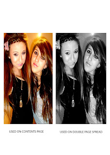
To change this photo, i changed the levels first. Doing so i made it brighter and then darker and couldn't chose what i liked more. However i ended up going darker as i liked how their hair changed and how they looked in it. As it again wasn't a main focus in the double page spread i turned into black and white inkeeping with the theme. However, i then decided i wanted to use this photo in my contents page so i went back and change the levels again.
Original
Edited
This photo i didn't take myself however i was there when it was taken. I used this photo as i thought that i needed someone or something different to be incorporated into my contents page. Beth the person in this photo has been used as a writer for the magazine for red carpet purposes. In this photo to change it, i got rid of the back ground and made it completely invisible all around her. I did so to be able to put her onto a red carpet scene with logos and writing behind her. I also changed the levels on her to make her stand out a bit more and make her look better.


No comments:
Post a Comment